Prudent Wall Coatings
February-April 2022
Prudent Wall Coating’s is a client who specializes in interior and exterior painting as well as drywall. The owner has been in the industry for 19 years and has decided to start his own Company. He needed a brand and a website that showcased his expertise.
Dive in to my process
Concept
I met with my client to talk about his experience, his vision, and his goals for his company. The client did not have a clear vision as to what he wanted his brand or website to look like so instead of talking aesthetics we talked about the why. Why was he in this industry and why did he want to start his own company? While discussing this project I made note of words that were consistently used and decided to start my design using word associations. I then chose colors and images that that I felt represented the company’s adjectives.
Branding
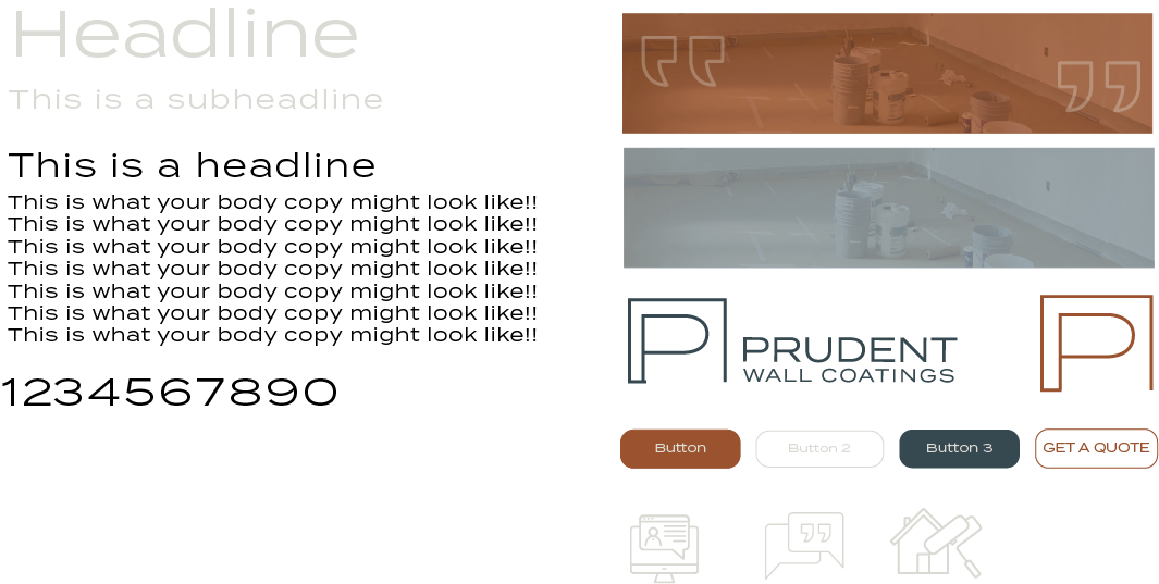
Now that I knew the how I wanted the brand to feel it was time to design the brand identity. I needed a logo family that was able to feel grounded, familiar, and masculine. I used color psychology and decided on a palette that was based on blue which created a sense of trust, tranquility, and familiarity. I paired the blue with a rustic orange to add warmth and energy.
Information Architecture and User Stories
I like to begin my design process with designing the Information Architecture of the site which focuses on organizing information that can and should be offered for the site. It also helps me structure the website as well as set up the beginning stages of web flow. To do this, I wrote down different information on sticky notes to card sort and group similar information.
Next, I created user stories to better understand various user’s needs. I made a list of different users who would be visiting the site and defined what their goal for visiting the site would be. I then defined what actions they may want to take to accomplish their end goal. Referencing my Information Architecture, I would check to see if the user would in fact accomplish their goal. Lastly, I wrote a conclusion describing how the site would accomplish their goal.
I repeated this process throughout multiple user stories adjusting the Information Architecture as needed.
Website Concept and Wireframes
Now that I knew who was using the site and the content that I needed I started wireframing the site. I knew that I wanted the quality of work and experience to speak for itself. To do this, I wanted to develop a site that was image heavy with complimentary text. I began with the homepage and wanted to open the site with an image, list the services, and show them how easy it was to achieve their custom project. Throughout the whole site I wanted to reiterate trust so I wanted to include an about section on the homepage. I knew I wanted to highlight his credentials and also reiterate his quality of work with a review. When designing the footer I wanted to include a contact form so there was always a consistent opportunity to start their project.
UI
After organizing the information it was time to design the UI of the site. Because the information in the site will be new to users I wanted to make sure that it was delivered in a consistent manner. I began by creating hierarchy using text and color as well as textures. I created different buttons to draw emphasis towards the desired action.
Home Page
Referencing my wireframes I knew that I wanted to feature a photo with some text to grab the user’s attention followed by a list of their services offered that are also clickable links to take you to their respective pages. I wanted to create a section to explain how Prudent’s process works. Most users won’t know how the process works I wanted them to feel included and to show them how easy it can be to get what they want
Next I wanted to introduce the who and why of the company. The client made it clear they did not want to be on the website and that they wanted to focus on their experience. Users want to know who exactly is coming in to their space and if they can trust them. I wanted to reiterate the core values of the company as well as introduce the owner and highlight his credentials.
Just to reiterate and validate his quality of work I wanted to include a review section so the user could trust his reputation.
Designing Gallery
After the hompage I wanted to design the gallery. This page was important to me because I wanted his work to speak for itself. Referencing my user story, I knew that I wanted to see the overview but after learning if the company offered the services I needed, I wanted to see examples of their work. I knew I wanted to start off with a good first impression so I highlighted the finished projects first in the gallery page. As the user scrolled down the page they are able to see a bit more of the process. Where a projected started and how Prudent transformed the space.
The Full Site
After the gallery template was created I designed a service page as well as a service detail page. These gave a bit more insight in to what exactly he does in the respective areas for those who may not know what exactly is included in the interior and exterior painting as well as the drywall. Lastly I added a contact page.
Design SpecsFebruary-April 2022
Responsibilities
Research
Design
UX Methods
Research
Branding
Wireframes
UI
User Testing
Tools
Adobe Creative Suite
Figma
Squarespace


